
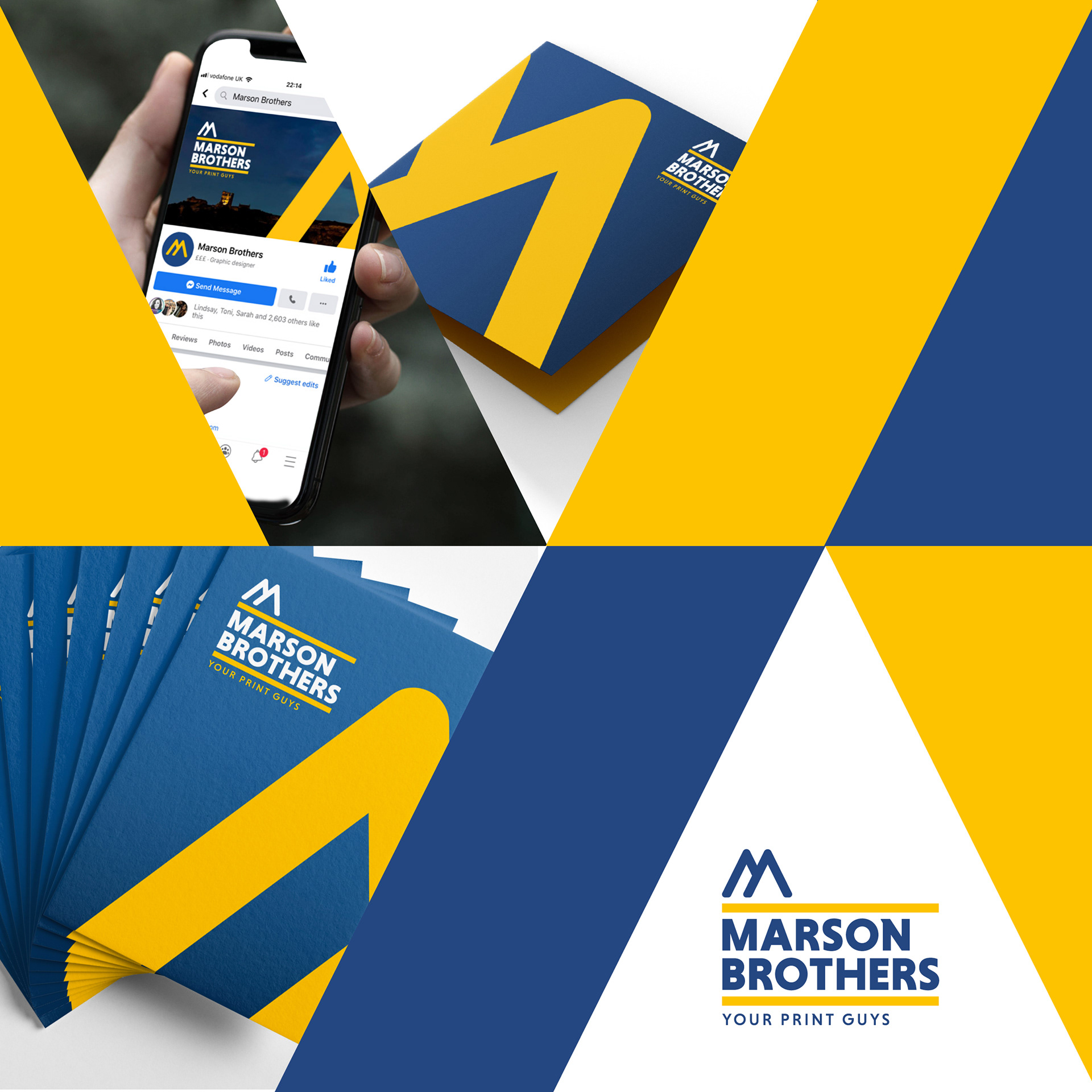
A brand refresh was given to Marson Brothers to create a bold and contemporary look that allowed for playful abstract layouts amongst their marketing materials. Whilst still maintaining the brand colours, the identity allowed for the bold symbol to be used alone to represent the overall image.